Thanks for visiting Plain Brown Wrapper! The blogging fun has moved to Adventures in Improving Access. See you there!
Read More......Saturday, April 16, 2011
Sunday, March 7, 2010
Budget cut blues
My HQC blog has moved to Blogger to join Plain Brown Wrapper.
The Sask. budget is coming down in a few weeks, and I'm already worried about QI drawing the short straw.
Posted by
Kishore Visvanathan
at
1:41 p.m.
![]()
![]()
Labels: Quality Improvement 0 comments
Monday, August 31, 2009
What's wrong with this picture? - XV Don't mess with success!
Hi! Long time, no see.
Thanks to Mark Wahba's keen eye for this one:
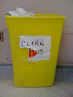
Bright yellow "Sharps" containers are ubiquitous in health care facilities. Pointy, pokey stuff goes in them after it's been used. This reduces the chance of needle-stick injuries. While the containers come in different shapes and sizes, their uniform yellow color is a strong visual cue as to their presence and purpose.
However, someone tried to "re-purpose" this large sharps container for something else. They had relabeled the contained, but that label didn't last long. Even if it were now being used for regular garbage, it's still unsafe because the staff emptying the garbage wouldn't be expecting uncovered needles in the container.
Surely, you say, a person would stop and think before dropping sharps into this container. After all, there are clues that it isn't a real sharps container: it's sitting on the floor, there's no safety top to prevent people's hands from rooting around inside.
You'd be wrong. Mark mentioned that he had dropped one sharp into it already. And why wouldn't he... the containers give a (supposedly) unique visual cue.
The best part of this story is that Mark pointed (sorry...) out the problem to the department manager, and the practice was stopped!
Here's another example of someone messing with visual cues:
Clean isolation gowns used to be folded and stacked on carts outside a patient's room. You would put one on, enter the room to perform care, and then discard the dirty gown into a laundry hamper outside the room.
Then, someone had the idea of leaving the gowns unfolded, in large plastic linen bags. I'm sure that saves a lot of time by cutting out the folding process. Unfortunately, the "clean" plastic linen bag with rumpled gowns in the bottom of it just screams "Put your dirty laundry in here!" Once a dirty gown has been dropped in, the entire bag is contaminated, and has to be laundered again. Or, worse, the wayward gown is not recognized and then is a source for cross-contamination for another patient.
I've made the mistake myself.
Someone has recognized that it's a problem and tried to remedy it with a hand-lettered sign on the bag. Nice try, but the sign presumes that the person about to dump their dirty gown into the bag is approaching it from the side the sign is on. Also, it presumes that they can read English.
We get clear and important information from standardized visual cues: Skull and crossbones on a plastic bottle - Poison!, Red light - Stop! They prompt us to act, or prevent us from harmful action, in critical situations, without the need for deliberation. Don't ignore people's mental inertia when redesigning the system.
Posted by
Kishore Visvanathan
at
2:58 p.m.
![]()
![]()
Labels: Communication, What's wrong with this picture? 1 comments
Thursday, March 19, 2009
Welcome Canadian Health Improvement Forum attendees!
Thanks for coming to my presentation of BOMB! How a (failed) career in standup comedy made me a better surgeon. I look forward to receiving your feedback. Please click here to take the survey. You'll need the password from your souvenir postcard!
This survey closes on Tuesday, March 31.
P.S. Got time on your hands? Check out "What's wrong with this picture?"
Posted by
Kishore Visvanathan
at
11:06 p.m.
![]()
![]()
Surgical checklists hit the big screen!
Well, almost. The ever-topical TV show, ER, featured surgical checklists in a recent episode. If that's what it takes to get the momentum going on implementation of checklists, I'm OK with that. Pressure and interest from the public will be a very powerful force to convince recalcitrant OR staff. (And, when I say recalcitrant OR staff, I think you know who I'm talking about.)
Posted by
Kishore Visvanathan
at
10:52 p.m.
![]()
![]()
Labels: Communication, Quality Improvement, Safety 0 comments
Sunday, March 8, 2009
What's wrong with this picture? - XIII

Last week, I noticed someone had nailed a green doodad onto the door of each operating room.
Any guesses what it's for?
I suppose this is a trick question "What's wrong with this picture?" because this is really an example of great design. WWWTP is usually about bad design, but I'm going to broaden things a bit to allow for this doodad.
It's a room marker in case we have to evacuate the OR because of a fire or other disaster. The fire marshall checks each room to make sure it's empty, then closes the door and flips the doodad up so it rests on the door frame in an upright position:
If anyone opens the door again, the doodad swings back down to its original position, indicating that the room may have been reentered.
Simple. Brilliant. Sweet.
Posted by
Kishore Visvanathan
at
10:56 p.m.
![]()
![]()
Sunday, March 1, 2009
'Difficult' patients
Want to know what patient-centred/patient-directed care could look like? Read "On being a 'Difficult' Patient" by Michelle Mayer.
Then, if you have some time, and a box of Kleenex, go to her blog "Portrait of a Dying Mom".
Posted by
Kishore Visvanathan
at
10:55 p.m.
![]()
![]()
Labels: Communication, Quality Improvement 0 comments
